The 1950s was a decade characterized by post-war optimism and a desire for modernization. This era also brought about a new sense of style in home decor, particularly in the use of color schemes.
From bold and vibrant hues to soft pastels, the 1950s offered a wide range of color choices for house exteriors and interiors.
In this article, we will explore the top 40 house color schemes from the 1950s, each with its own unique charm and retro flair.
Get ready to take a trip down memory lane and discover the vibrant color palettes that defined the homes of this iconic era.
1950 House Color Scheme
Important Point
Also, Read: Top 18 New Orleans House Color Schemes
Also, Read: Top 8 Suburban House Color Schemes
The 1950s marked a significant period in American history, with a post-war boom leading to a rise in housing construction and suburban development.
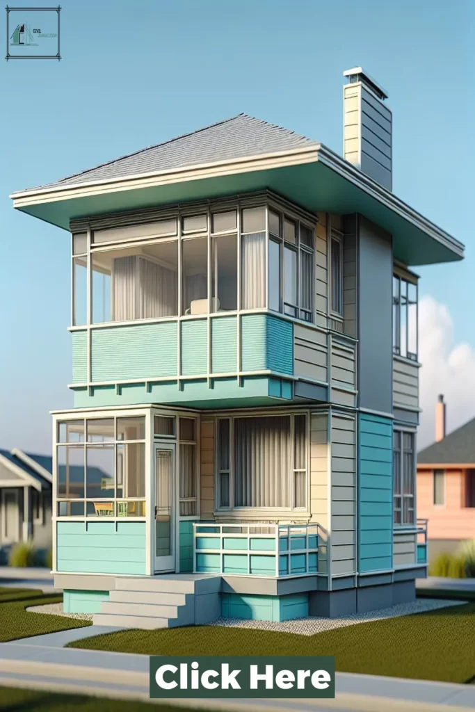
This era also saw a shift in architectural styles, as modernist designs and influences from Europe became popular.
This, in turn, inspired a new color scheme for houses in the 1950s, incorporating bold and vibrant colors to reflect the optimism and progress of the times.
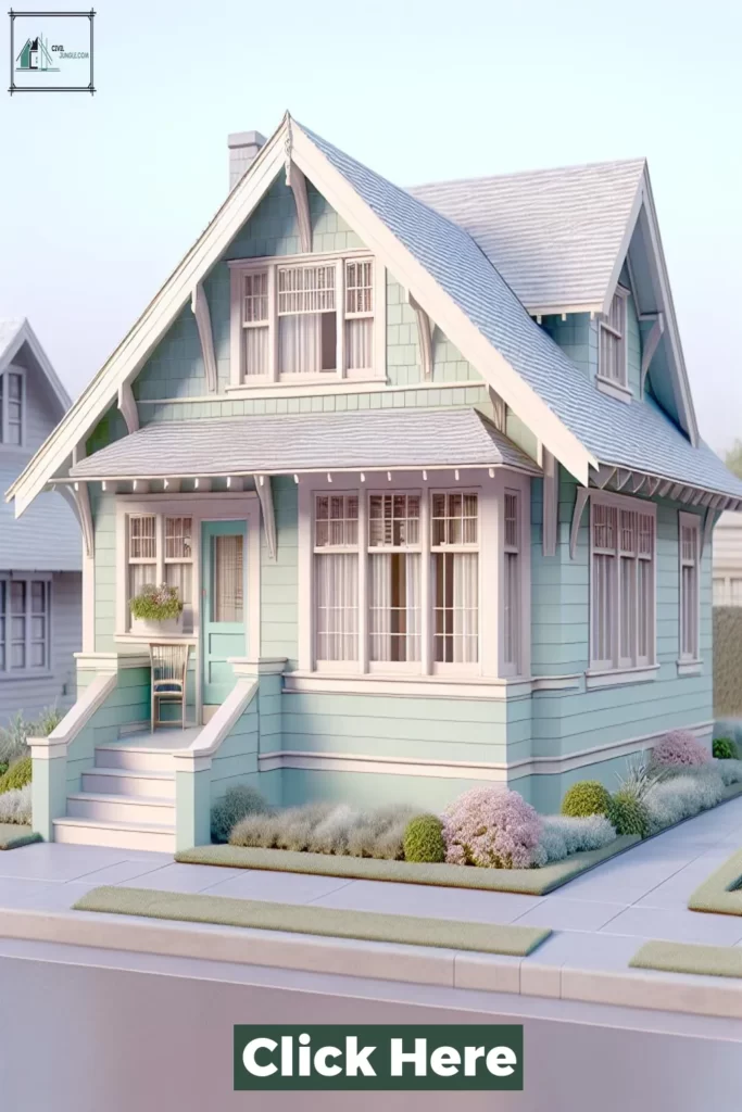
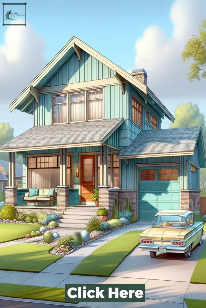
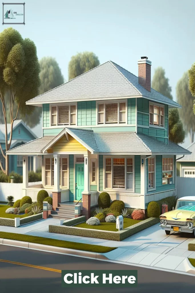
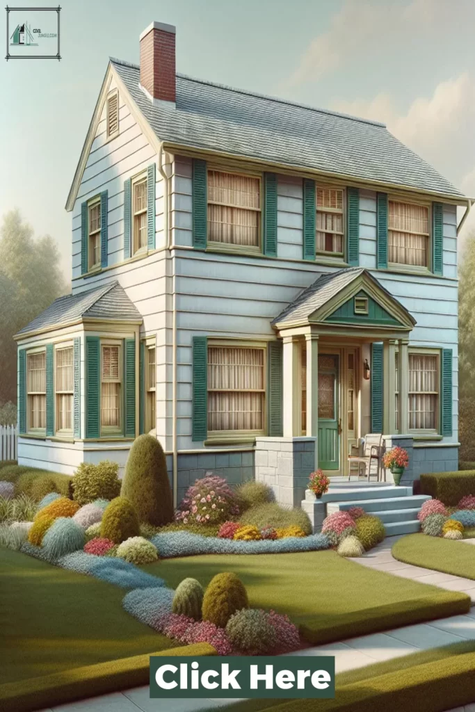
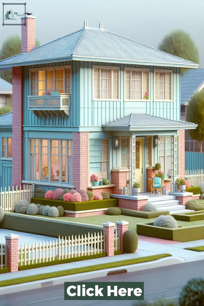
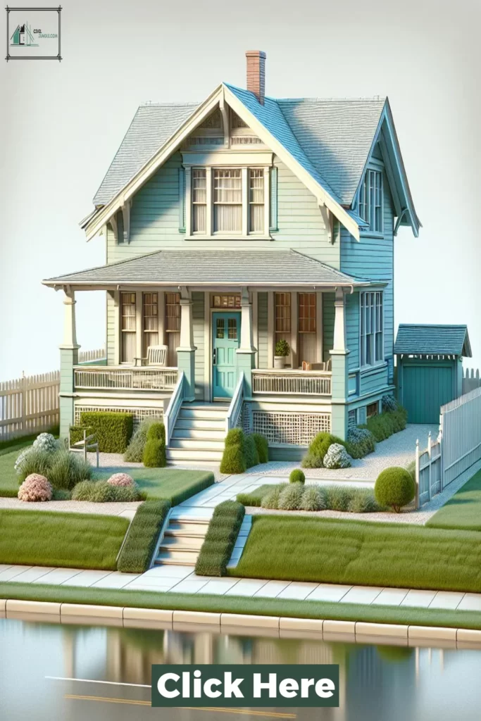
The exterior color scheme of a 1950s house typically included bright shades of yellow, blue, green, and even pink.
These colors were often applied to the entire house or used in conjunction with a neutral base color such as white, gray, or beige.
This created a playful and eye-catching contrast, making these houses stand out in the suburban landscape.
For the roof, asphalt shingles in shades of red, brown, or gray were commonly used. These colors provided a traditional look while complementing the overall color scheme of the house.
The use of brick or stone accents on the exterior walls was also popular, adding texture and warmth to the overall design.
The front door of a 1950s house was an important focal point, with vibrant colors such as red, blue, or green often used to make a statement.
This was often paired with a contrasting color for the shutters and window frames, emphasizing the overall color scheme.
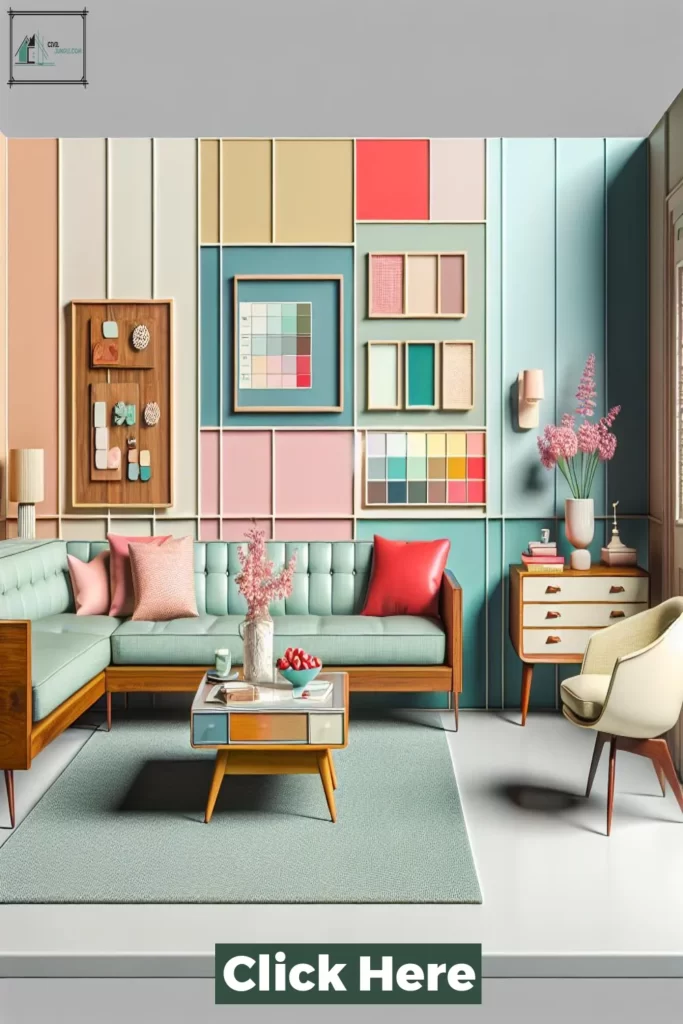
Inside the house, the color scheme tended to be more subdued and neutral, with a focus on light and airy spaces. Walls were usually painted in shades of white, cream, or pale yellow, offering a clean backdrop for the furniture and décor.
However, pops of color could also be found in the form of brightly patterned wallpapers, especially in areas like the kitchen or bathroom.
In terms of interior design, the 1950s favored a mix of modern and traditional styles. Furniture pieces were often made of wood with tapered or hairpin legs, reflecting the mid-century modern influence.
Colors like avocado green, mustard yellow, and burnt orange were popular for upholstery, adding a touch of vibrancy to the otherwise neutral interiors.
Conclusion
In conclusion, the 1950’s was a decade marked by vibrant and bold color choices in house design. From pastel hues to bright primary colors, the Top 40 1950’s House Color Schemes truly captured the spirit of the era.
These color schemes not only showcased the changing trends and attitudes of the time, but also embodied a sense of nostalgia and youthfulness.
Whether you are looking to add a retro touch to your home or simply appreciate the aesthetics of the 1950’s, incorporating these color schemes into your house design can bring a unique and charming look to your living space.
So go ahead and embrace the vibrant colors of the 1950’s and create your own modern-day Mid-Century masterpiece.
Like this post? Share it with your friends!
Suggested Read –


